Sales follow-ups in Office 365
Date:April 30th, 2013 Author:Stuart Pegg Tags: Alert summaries, Office 365, Overdue alerts, Reminder, Reminder 365, SharePoint alerts, SharePoint OnlineCategory: Reminder 365, SharePoint Alert, SharePoint Online / 365 / Cloud Comments:0 ;
")
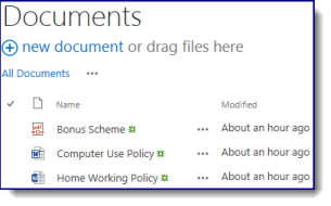
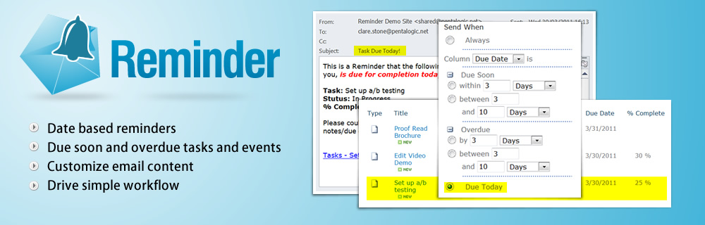
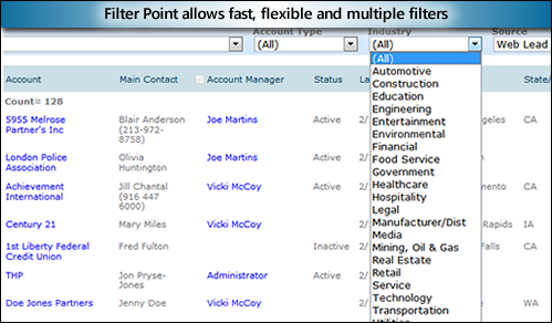
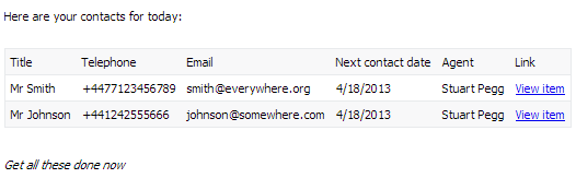
If you’ve got a list of potential or current customers, it’s likely you’ll want to keep in regular contact with them (especially in the case of sales leads). So skip making checking the list every morning, and just get a summary e-mail of today’s contacts. That’s less time logging in or messing around trying to use SharePoint from a mobile phone, and more time making calls.
Here’s how you’d set it up
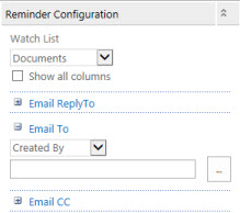
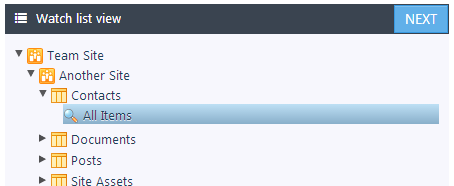
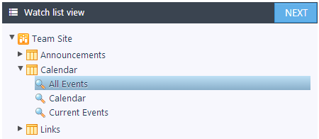
Select your list and view:
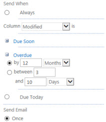
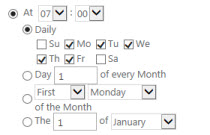
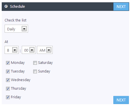
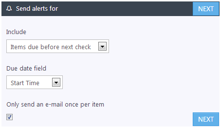
Then choose when you’d like the e-mails sent:
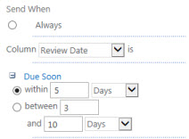
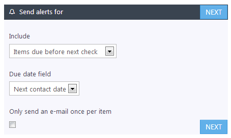
Next choose "Items due before next check" and the column with the next contact date in (this will send e-mails for contacts due today):
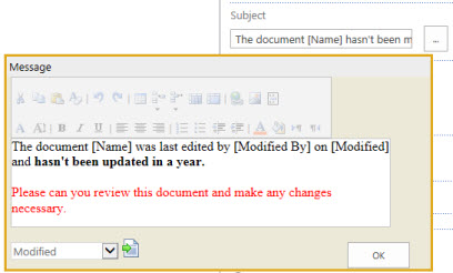
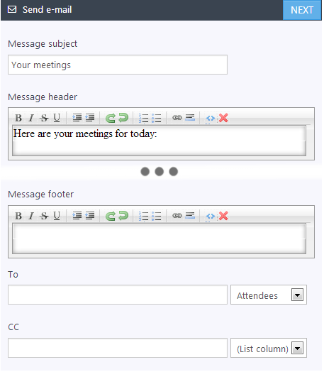
Then give the e-mails a subject, header, and a motivational footer like ours:
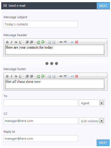
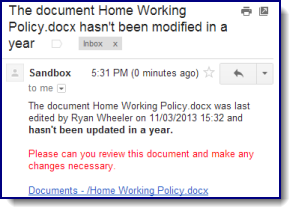
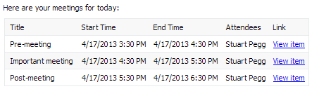
Above we’ve chosen to send e-mails to the assigned Agent, CC-ing the manager. Give it a name, save it, and that’s it! Reminder 365 will start delivering e-mails like this every morning:


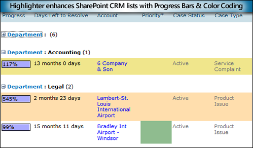
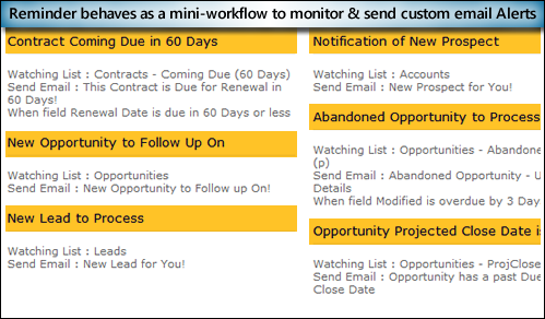
 Create alerts for due or overdue items