SharePoint offers a great foundation for non-programming business people to build applications around our business processes, just the way we want them. This guide will show you how to build your own SharePoint staff vacation and absence planning system.
Staff vacation and absence planning can cause trouble and strife in any organization. The good old wall planner can work for staff who are all in the same physical locations . . .
. . . . until you approve an absence then forget to enter it on to the planner, and then allow someone else to book vacation at the same time, leaving your department under staffed.
. . . . .or until you forget that Sam has booked a week’s vacation and call him up furious on Monday morning asking why he isn’t in work.
. . . . . .or authorize Jenny’s week off in the Caribbean only to get a thorough ticking off from HR because you have allowed Jenny to exceed her annual leave entitlement.
I’ve been guilty of all these crimes in my time. So I was pleased to find that with SharePoint we can make things a little more organized, and using our PivotPoint, Reminder and Planner web parts together we can set up a slick little Vacation Planning system in just a few minutes.

So, what we are aiming for here is:
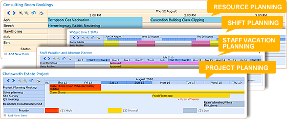
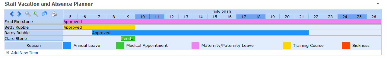
- A dashboard “Absence Planner” display, which will be accessible to all staff via SharePoint.
- A personal and managers “Absences to Date” dashboards.
- An automated Absence Request approval system
- An email reminder to line managers of imminent staff absence.
To be clear: this is not a ready made “Vacation Planning” template or application, its a guide showing how you could build your own system, using some of SharePoints built in features and then add a little pizazz with our web parts. Its going to take a little work to set this up for your organisation but then it should be a better fit than a packaged solution.
Setting up the Vacation Planner should take you about an hour if you have our webparts already, a little more if you need to download them. So we have broken this guide up into 4 parts, which we will be publishing over the next 5 days:
Today – set up your Staff Vacation and Absences list and filtered views
Part 2 – set up a Staff Vacation Planner dashboard with SharePoint Planner webpart
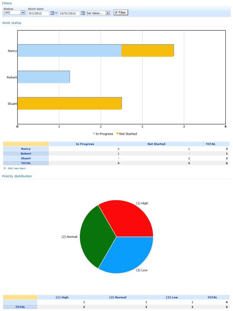
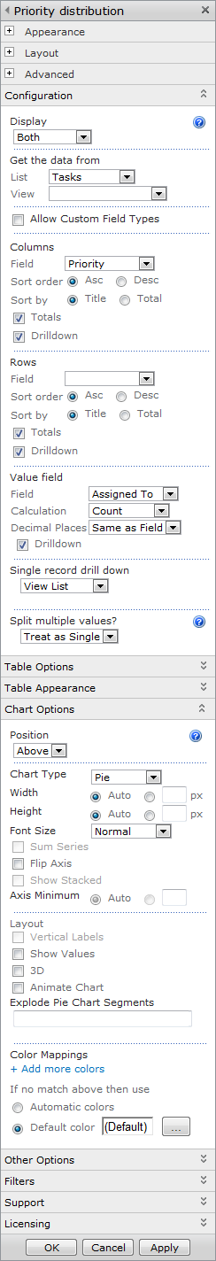
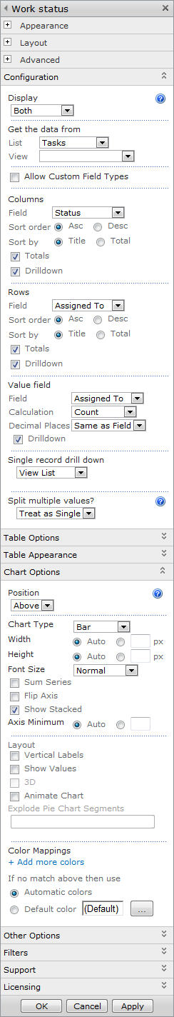
Part 3 – Set up Absences to date dashboard with SharePoint PivotPoint Webpart
Part 4 – Set up a absence request and approvals workflow with SharePoint Reminder Webpart
Part 5 – see the system in action, and see how much of this you could achieve with SharePoint out of the box.
For those of you who can’t wait that long, you can download the full PDF guide and a 30 day free trial of the webparts here.
First set up your List
We are going to use a Calendar List, add some extra columns, and switch on Approvals.
So, from which ever section of your site you want choose select Site Actions from the top right of the page, then from the dropdown, select Create then from the Tracking tab, select Tasks.
Call your list whatever you want – Staff Absence Planner works for me, decide whether you want it to display in the quick launch menu – probably no need as few people will need to access the list that way once we have our system set up. Then select no in the Alerts option. Click OK and you list is set up.
Now go to the Settings tab in your list and first of all choose Create Column. We are going to add a few extra columns to the list. Add the columns Requested By and Authorized By, the column type for both of these is “Person or Group” and you want them both to display in the default view. Make these mandatory fields by clicking Yes for Require that this column contains information. Now we are going to add a column to show the reason for the absence – annual leave, maternity leave, training, sabbatical, whatever. The column type for this column is going to be Choice and again we are going to made completion of this field mandatory, and show the field in the default view. Finally a column for the number of days of each absence, we want this to be a number column, I have set the minimum value to 0.5 days and the maximum to 30 days, and again we want it to be a mandatory field.
Next let’s switch on Approvals. Back in the Settings tab of your list choose List Settings and from the General tab choose Versioning Settings. In Content Approval click Yes and we are done with the list set up.

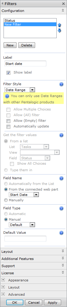
Set up Filtered Views
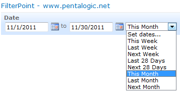
Now for the filters. If you haven’t made much use of filters before it may be worth having a look at these resources:
SharePoint filter techniques articles
Filters can really enhance the power of SharePoint lists, and we are going to use 3 here in our vacation planner.
#1 – Approved and Pending Absences for Planner
We want our Planner to provide a dashboard display for all staff, showing absences requested and approved. So that staff can see when it will be possible to book an absence and managers can decide whether they wish to approve a staff absence request.
Our list actually contains 3 approval status’s “Pending”, “Approved” and “Rejected” we don’t need to display absence requests that have been rejected on our Planner, so we are going to set up a list view to show just “Pending” and “Approved” requests.
Go back to Site Settings and choose Create View. From the menu here choose Standard View. N.B. This choice is very important – Planner only works on Standard views. In the Create View Page add a name for your view, we have used Staff Absences – Approved and Pending. In the Audience section be sure you have checked Create Public View this again is an essential for Planner to work. In the column section choose the columns that you wish to display to people who are creating or entering a list item. This will not impact of the Planner display.
We are then going to skip over the “Sort” section and from the Filter section choose Show Items only when the following is true.

Column Approval Status is equal to Pending OR column Approval Status is equal to Approved. Click OK and we are done with the filter.
#2 – Approved absences for managers “Absences to Date” Dashboard
Set up of this is exactly the same as the last one, except we are going to call it “Absences to Date” and just show items where column approval status is equal to approved.
#3 – The Magical [Me] Filter, for “My Absences” Dashboard.
If you haven’t used this filter before you are going to love it! It shows whoever is logged in just the list items relating to them, so its ideal for our “My Absences” dashboard view, but also has a whole host of other uses.
We need a Standard, public view again – yes even though it’s “My Absences” it’s still a public view or other people won’t be able to use it. Call it My Absences then head down to the filter section and choose to show items where column Requested By, is equal to [Me].

So, now we have laid the foundations for our system by setting up the basic list and filters.
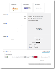
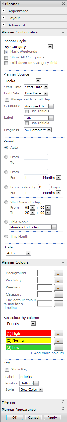
In Part 2 we will create a “wall chart” dashboard, using SharePoint Planner webpart.


 Name the column Due
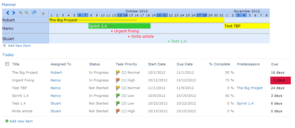


