How to create progress bars in SharePoint

Date:May 10th, 2011 Author: Tags: , , , ,
Category: Highlighter, SharePoint Development, SharePoint Free Tools Comments:7 ;

progress

Progress bars are a great addition to any list; making percentage values, target achievement, and progress between dates much clearer. Having included this functionality in SharePoint Highlighter, I’ve tried and tested the various ways this can be achieved and thought I’d share my conclusions.

The main methods for getting a progress bar on your list are:

Client based

  • JavaScript: Put some JavaScript code into a Content Editor Web Part
  • Designer: Use SharePoint Designer to create a custom view

Custom Field Type

  • Free Download: Install a community-supported custom field type
  • Code it yourself: Make your own custom field type from scratch
  • Buy: Purchase a pre-made solution

JavaScript document_into

If you need a free solution that doesn’t require farm administrator permissions, then Christophe’s JavaScript progress bar may be what you’re looking for. This uses JavaScript in a Content Editor Web Part along with a calculated column to render the progress bar.

To customise this to suit your needs you need to have some experience with JavaScript. Alternatively, Christophe is very quick to respond to comments, and may be willing to help with minor tweaks or troubleshooting.

Advantages of this method are the flexibility of Christophe’s HTML calculated column, and the low cost (providing you don’t spend too long customising it). Although by far the largest advantage is that most end users will be able to implement this solution without having to contact their IT department.

The main disadvantage is having to implement the CEWP on every page you want to see the progress bar, and the need to change the JavaScript in every CEWP for any future alterations.

Designer designer

If you’re reasonably familiar with SharePoint Designer, or you’re willing to learn a little, then the Microsoft SharePoint Designer Team Blog has a good article on how to use it to create progress bars: CSS Style Bar Graphs using Data Views

The main advantage of this solution is that it is free (SharePoint Designer is a free download), not counting the cost of the time to create it of course. As with the JavaScript solution, you will need to add the modification on each page you want the progress bars to be displayed.

SharePoint Designer has a chequered history with regards to the amount of power it wields (and hence damage it can cause), and so it is unfortunately often the case that SharePoint site administrators ban or severely restrict its use.

Free Download arrow_down_green

If your requirements are quite straightforward, there are a few community supported progress bar custom columns available for download (for example this Codeplex project).

These are single-purpose additions that tend to be low on customizable options (such as conditional formatting), but are good for quickly meeting specific requirements.

These community supported progress bars are usually open source, which allows you to further develop them if you wish. The above example is an exception; being both closed-source and obfuscated. Support for community projects is unfortunately entirely voluntary, and usually forum-based.

Code studio

If you’re reading this section rather than trying to ignore it you’re probably a developer, or thinking about hiring one. I can tell you from experience that unless you have some very specific requirements or intend to re-use the code for other solutions, it will almost certainly be cheaper to buy a pre-made solution.

This is for the most part due to the rather large overhead of setting up the infrastructure of a working custom field type and the daunting learning curve associated with it. For the sole purpose of creating a progress bar, this investment of time may be disproportionately expensive.

Obviously having a vested interest in you buying our product makes my advice somewhat tainted, so I’ll refer you to the impartial words of Bjørn Furuknap on the subject:

“Looking back I think it would have been easier, and less painful, to eat my own eyes.”

If you’re brave enough to continue down this path, creating your own custom field type allows you to tailor a solution much closer to your needs, limited only by your determination and ability to think sideways. To help you on your way, there is a particularly useful MSDN walkthrough.

Although MSDN as a whole is a gold mine for such a project, there are some rather troublesome areas that are thinly documented.

Buy currency_dollar

There are a number of commercial products on the market that allow you to add visual indicators such as progress bars to lists; one in particular that springs to mind (for some reason) is our own product SharePoint Highlighter.

Many commercial solutions come with additional features that may make the purchase more worthwhile. Rather than throw marketing bullet points everywhere (Synergise ROI!) I’ll simply nod meaningfully towards this comparison matrix.

Enormous professional bias aside, the main benefits of a commercial solution in comparison to the above alternatives are: guaranteed support, more reliability, and user-friendlier configuration. Of course, the glaring disadvantage is having to spend some money up front, rather than the less visible cost of time.

Conclusion about

Each of these possible solutions caters to a slightly different problem, and there is no single right answer. Obviously if there was a single correct, reliable, unbiased answer it would be to buy SharePoint Highlighter*.

*Possibly not entirely unbiased

SharePoint Highlighter Released for Sale – See it, Try it, Buy it!

Date:May 6th, 2011 Author: Tags: , ,
Category: General, Highlighter, SharePoint Ideas Comments:0 ;
At last we are there!

After months of heated debate, midnight-oil-burning and general blood, sweat and tears, our latest new product, SharePoint Highlighter is released for sale today!SharePoint Highlighter Features

So come on, what are you waiting for? Get those credit cards out! You know you can’t do without the ultimate tool-kit for brightening up your SharePoint lists!

We realise that although Highlighter has been the centre of our universe for the last few months, some of you may have had other things to think about.  So, in case you have forgotten Highlighter is a custom column for SharePoint that lets you add:

  • Highlighting,
  • Color coding
  • Icons
  • Progress bars
  • Countdowns
  • And more

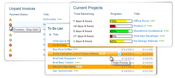
Let’s face, it compared to a lot of things we look at on our screen every day – things like the Facebook Wall, or a Google Search, or even an Outlook Calendar – a SharePoint list can look pretty dull.  You can easily find yourself staring at a mass of information, wondering “What is exactly is going on here?”, and “What on earth am I supposed to do with this?”

So Highlighter gives you a whole box of tricks to brighten up those lists and libraries, and make them much more user friendly.

You might choose to highlight high priority items in red on an issues list.

Or flag unpaid invoices by color, depending on just how old they are.

Or use color coded progress bars to show where you are in relation to your KPI’s or targets.

Or countdown to a task or event due date.

The possibilities are endless and with Highlighter you have a whole range of visual indicator options, allowing you to mark up your lists exactly as you want them.

We set ourselves two challenges when developing Highlighter:

  • Give people flexibility, a choice of options within one product.
  • Keep it simple, and easy to use.

We looked at what was on the market already and we found that although you can buy a progress bar, or a color coding column, or a KPI column for SharePoint, there isn’t anything out there that gives you a whole bundle of these options, all in one tidy product.  In fact, to get all the features you will find in Highlighter from anywhere else you would have to go to at least 3 different software providers – and pay more than double the money. 

So we think we are there with the flexibility, but what about ease of use – don’t all these choices make for a really complicated set up interface?

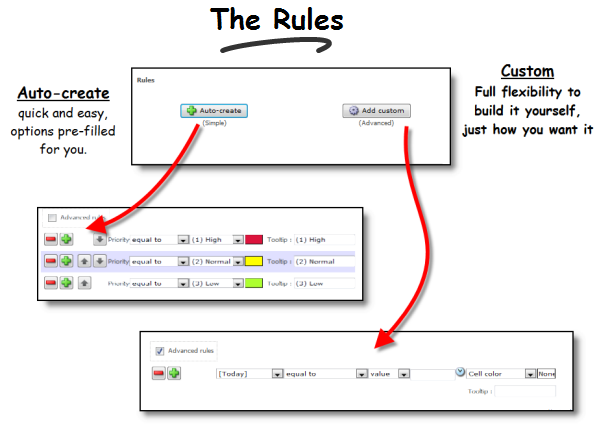
Well, hopefully not.  The really complicated (and powerful) bit is there, in our “Advanced Rules” section, but lots of people will never have to use this.  We have spent time developing the user interface, making it intuitive, so that lots of scenarios are actually set up semi-automatically.  When you use the software you will see that what you want to achieve can often be managed in just a few clicks.

So, what’s this all going to cost then?  Well just $995 for a single server license.

Plus, of course our 30 day free trail, which will give you plenty of time to see just how handy Highlighter is.

We hope you will give the product a try, and look forward to hearing your feedback.

Download the 30 Day Free Trial Today.

SharePoint Highlighter – Beta Testers Needed!

Date:April 15th, 2011 Author: Tags: ,
Category: General, Highlighter Comments:0 ;

We’re very nearly there – a couple more weeks and with a fair wind and a bit of luck SharePoint Highlighter should be ready for full public release (i.e. the bit where we actually get to charge people for using it!).  But first we need some Beta Testers.

Public Beta testing is the last and maybe the most important stage of the product testing process.  This is where we get to find out how people are really going to use the software. Whether we have got it right – or not, nerve-wracking doesn’t really cover it.

So we really want you to get involved.

Let me just remind you what SharePoint Highlighter does.

It’s a custom column for SharePoint that lets you add highlighting, color coding, icons, progress bars, countdowns, dynamic highlighting and more to your SharePoint lists.  We think it’s probably the only SharePoint tool on the market that has all this in one easy to use package.

And it really is easy to use now.  Our final stages of in house testing saw us making some changes to the user interface, which mean that for the great majority of highlighting you may want to do, you will be able to use our new “automatic” button, and set things up in just a few clicks, and a few seconds.  Whilst for those who want to do something a bit more fancy the full power of Highlighters “Advanced” options are just a click away.

So, why be a beta tester?  Well you get to be one of the first to play with a brand new SharePoint tool and try to break it. We’ll be really grateful, and we’ll give you a nice discount when the product is released for sale – and it’s fun!

But beta testing isn’t for everyone.  There isn’t a full manual yet, so you need to know your way around SharePoint reasonably well.  The software is still in development so there may still be bugs.  You should never install a beta on a live SharePoint environment; you need a test or development server to play.  And we will be looking for lots of feedback, so you are going to need some time to play with the product.

So, now you’ve had a look at all the warning signs, if you still think beta testing is for you we would be really grateful for your help.  You can download the beta here.

If beta testing doesn’t sound like your kind of thing you can still pre-register here for the full public release, which we expect to have ready for you at the beginning of May.

SharePoint Charting in PivotPoint – Coming Soon!

Date:April 13th, 2011 Author: Tags: ,
Category: General, PivotPoint Web Part Comments:0 ;

I am sure you have noticed that there is a lot going on here at Pentalogic lately.  Just a couple of months ago we launched FilterPoint, which brings fast, flexible filtering to SharePoint lists and web parts.  Then we unveiled SharePoint Highlighter which gives you a whole range of color coding, icons and effects to brighten up your lists.  And our new free tool View Rescue sorts out an annoying niggle for SharePoint 2010 users.

But we haven’t forgotten our existing products.  Feature requests for Planner, Reminder and PivotPoint come in from customers all the time and new versions of all 3 are planned for the coming months.

First off the blocks is PivotPoint with the new version out by May.  We are very excited about this and we hope you will be too.

PivotPoint v2 includes a host of handy new features like drill down form the Pivot table to relevant list items, the handy “Add New” button which Planner users will be familiar with at the bottom of the display, and charts and graphs.

The charting and graphing functionality will mean that you will be able to choose to view bar, line, pie. Column and area charts as well, or instead of the traditional Pivot table.

We think that this is really going to bring dashboards to life – imagine your Sales Team being able to view “Sales to Date” as a dynamic color bar chart, generated straight from the SharePoint list?  Or the Helpdesk viewing a pie chart of current open requests by status, or age?

We have always thought PivotPoint was pretty nifty:  it’s the only tool we know of that applies Pivot Table, or Cross Tabulation functionality directly to SharePoint lists.  But as they say, a picture speaks a thousand words (or in this case should it be numbers?) and we think that when you see the charts PivotPoint can produce directly from SharePoint lists, you are going to wonder how you ever managed without it.

PivotPoint v2 will be available in the next few weeks.  For immediate notice of the release subscribe to the blog RSS feed, or email me at: [email protected]

SharePoint Reminder and Upgrading to 2010

Date:April 11th, 2011 Author: Tags: ,
Category: SharePoint Reminder Comments:0 ;

We have noticed that lots of you seem to be upgrading to SharePoint 2010 now.  And lots of you are asking what you need to do to upgrade Reminder.

We know the whole process of upgrading your whole SharePoint installation to a new SharePoint version can be quite stressful.  So we have put some work in to trying to make the bit of that upgrade that relates to Reminder as simple and painless as possible.

We have put together a step-by-step guide to painless Reminder upgrading, which you can see here.

In summary:

  • If you hold a commercial license for SharePoint Reminder there will be no charge for moving to 2010, unless you are adding additional servers to your installation.
  • You should be able to move to 2010 without losing any of your existing Reminder settings.
  • If you are moving to a new server we may need to issue you a new license key, there will be no charge for this as long as you are de-commissioning your old server.

Read the full guide to a smooth Reminder 2010 upgrade here.

And if you have any questions or queries please do let up know.

Use SharePoint Reminder to Email Your Customers

Date:April 4th, 2011 Author: Tags: , ,
Category: General, SharePoint Reminder Comments:0 ;

We all know how great SharePoint Reminder for sending internal reminders and driving simple workflow. But have you tried it yet for managing the bits of your processes that happen outside of your organization? Sending emails to customers, suppliers or other contacts who are not members of your SharePoint deployment, or even members of your organization.

This is really easy to do and there are lots of places you might use this. Let’s look at some of the issues you’ll need to bear in mind.

General Tips

When you are sending emails to people outside your organization you need to ensure that:

  • you can actually send external emails from SharePoint
  • the email comes with a recognizable “from” label.
  • any replies go to an address where they will be dealt with.
  • don’t send a hyperlink to the list item in your email

inbox from

First,  to be sure that your STMP server allows relaying to outside addresses then you may want to use the diagnostics tool to send a test email to a private email address. – http://www.pentalogic.net/sharepoint-products/reminder/reminder-manual?p=configurationtool%2Fdiagnostics.htm

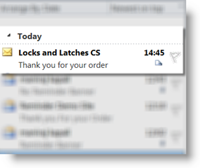
When sending emails to people outside your organization you will want to make sure that what shows up in the inbox is recognizably from you.  You don’t want your customers getting emails from “SP2010 Intranetxyz”, or some other random label. SharePoint automatically labels outgoing emails with the name of the site or subsite they have come from.  So for this example we are going to set up a sub site called “Locks and Latches CS” so that all of our emails to customers and suppliers will be clearly identifiable as coming from Locks and Latches Customer Services.

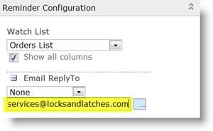
config reply toWhen a customer or other external contact replies to your email it’s important that that reply gets routed to an address where a real person is going to read it and deal with it.  You can write “please contact [email protected] in the body of your email until you are blue in the face – but you can be sure that a good percentage of customers who want to reply to you are just going to ignore that and click on “Reply”.  By default SharePoint will route all replies to emails it has generated to one central address – one address for the whole SharePoint deployment.  This address typically gets lots of mail, and often doesn’t get very closely monitored, so in Reminder we have the ability to override that and specify a “Reply To” address for each Reminder you set up.  For this example we are going to have all replies go to [email protected].  If in your own set up particular people are responsible for their own order you might choose to have replies going to the person who created the order record “Created By” or maybe the account manager for that customer “Assigned To”.  The main thing is that you ensure replies go to an email address which is monitored, and where they will be responded to.

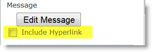
include HyperlinkDon’t send out dead end links or useless information. Both SharePoint’s built in Alert Me feature and SharePoint Reminder send out a hyperlink to the relevant list item in the alert/Reminder email by default.  If you are sending emails to external contacts this link will very likely be of no use, as the contact probably won’t have permissions to view your SharePoint site.  In SharePoint out of the box alerts you can’t customize your alert emails, but in Reminder you can, so when sending emails to an external contact remember to uncheck the “Include Hyperlink” box.

Reminder Set Up

order conf email edit email

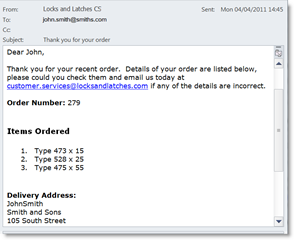
In this example we have used Reminder to send an email to a customer each time a new order is received.  The set up of a Reminder when sending an external email is really much the same as the set up of any other Reminder.order received config

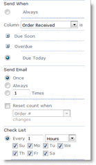
In this example Reminder is set to watch our orders list.  It’s set to watch the “Order Received” column, and email the address in the “customer email” column when “Order Received” is “Due Today”  – or equal to today.  Reminder is checking the list every hour, which means customers should get a confirmation email within an hour of their order being received.

Because “customer email” is simply a text field, and not recognized by SharePoint as containing an email address you will need to check the “Show all fields” box.

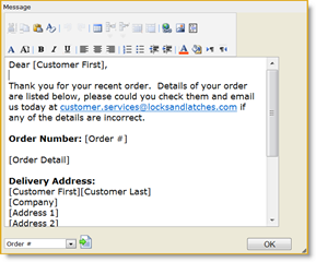
Customize your emails with merge data from your list, just as you would with a Word Mail merge.

And away you go, SharePoint Reminder emails for your customers.

Where Else Might I Use This?

There are loads of places where you could use this with customers, suppliers or other external contacts:

  1. delivery notification emails for customers
  2. overdue invoice emails for customers
  3. stock re-order emails for suppliers.
  4. meeting reminders for contacts.

to name but a few.

And if you have other examples of using Reminder to send emails to external contacts we would love to hear them.

reminder-download

ViewRescue for SharePoint 2010 – Updated!

Date:March 30th, 2011 Author: Tags: , , ,
Category: General, SharePoint Free Tools, SharePoint webparts Comments:0 ;

View Rescue

We’ve recently updated our free ViewRescue tool for SharePoint 2010 to version 1.1.2

This latest version will now work with customized Master Page templates, as long as you have an “AdditionalPageHead” control in your template.

See our website for the latest version (you can install this over the top of the existing version to upgrade) and details about this free tool  that fixes a common annoyance in SharePoint 2010.

SharePoint Highlighter – new product, coming soon.

Date:March 16th, 2011 Author: Tags:
Category: General, Highlighter Comments:0 ;

We are delighted to be able to let you know that we are about to add a new member to our family of SharePoint products.

Highlighter will let you bring your SharePoint lists to life with:

  • Highlighting – duh!
  • Color coding
  • Icons
  • Progress bars
  • Countdowns
  • And more …

Why did we feel the world needed SharePoint Highlighter you may ask? Well, SharePoint lists can be a little dull on the visual side. As people get more are more into dashboarding, finding ways of picking out different bits of information easily becomes ever more important.

When we looked at what’s on the market already we realised that though there are quite a few products that will give you one highlighting option – say progress bars, or KPI columns, or some kind of icon, there didn’t seem to be anything out there that would give users flexibility and choice in how they mark up their lists. So we thought we’d have a go.

After all how hard could it be?

“Looking back I think it would have been easier, and less painful, to eat my own eyes.”

Bjørn Furuknap

I’m quoting Bjorn because he kind of became our hero during the product development process. The problems challenges fell into three main areas.

First there was the inevitable SharePoint issue. Everything looks simple on the surface. The examples given look straightforward, then you start digging into SharePoint’s dark and dusty undocumented corners and everything suddenly becomes a lot less clear. Once you get in to custom columns you are heavily into uncharted waters. Which basically means you don’t know what you don’t know – and neither does anyone else. There is very little reliable information around on this area, so we do owe a debt of gratitude to Bjorn Furuknap,his blog and his excellent book: “Building the SharePoint User Experience” (APRESS). Rare beacons of light in our darkest hours!

The second challenge was narrowing down our options. There were so many things we could have put into Highlighter – bells, whistles, flashing lights, Unicorns. The temptation to make it all singing, all dancing was almost overwhelming. But we had to resist. If we had put everything we wanted to in it a) it would have been totally unmanageable, and b) we wouldn’t have released in until 2099. So we narrowed it down to the features that we thought would be most useful. The rest remains on our private list of “Shiny Things” possibly for future releases, depending on how many customers say that really need to have unicorns prancing through their lists!

And finally there was the user interface challenge. Though we have been quite strict with ourselves in terms of the number of features we have put in, Highlighter still does some pretty fancy stuff. So keeping the user interface simple and intuitive was always going to be interesting. What we wanted to avoid was presenting users with so many options at the outset, that they just ran away screaming. What we have come up with is an interactive interface – almost a “wizard” (but definitely not a helpful paperclip!) We think it is pretty easy to use and we hope you will agree.

Highlighter is a bit of departure for us, it’s not a SharePoint web part, it’s a custom column. Every time I go to switch it on I have to remember not to “add a web part” to the page, but to add a column to the list instead. I am a mere marketer and my feeble brain struggles with such changes in routine!

And the other first for Highlighter is that it’s a first as project lead for our new developer Stuart Pegg – new job, new project, new area of SharePoint – we really believe in trial by fire for our people! But Stuart has come through with flying colors and a great product that we think you are going to love.

Highlighter is now in the final stages of testing and will be available in public beta in the next few weeks.

We are inviting you to pre-register for the free trial now – which will mean you will be one of the first to get the product and will qualify for our product launch discount.

SharePoint 2010 and the mystery of the disappearing view selector menu

Date:March 8th, 2011 Author: Tags: , ,
Category: General, SharePoint webparts Comments:34 ;

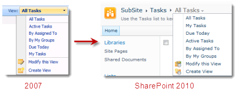
Remember the good old days, before SharePoint 2010, when a dropdown on the top right of a List View Web Part (LVWP) allowed you to select different views, quicly and easily?

In SharePoint 2010 we have lost this handy feature.  On some pages, a substitute does exist in the Breadcrumb on the title bar (which is part of the Ribbon, at the top of the page). It took us a little while to actually realize was there – but once we found it, it was very welcome.

SharePoint List View Selector Menu

But wait, all is not well. as Kerri from one of our partners – LookOut Software who develop CRM software for SharePoint – pointed out even the breadcrumb option disappears on the majority of pages. It disappears if you

  • Add another list view web part
  • Add any other web part such as a Content Editor Web Part containing things like instructions for the list
  • 3rd party web parts like our PivotPoint or FilterPoint tools that work really well alongside list views for creating dynamic dashboards.
  • use your list on a wiki page – and remember most of the pages in SharePoint 2010 are wiki pages by default now.

Also you don’t get it if you’ve created a new page and added a list view web part to it.

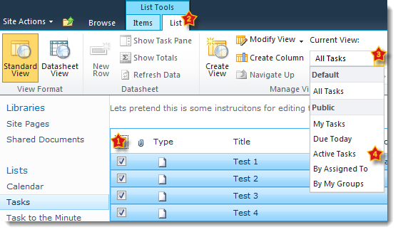
Once it’s gone, you have to resort to the following ninja moves to change a view. Select the list title (or something in the list) > List Tools > List, Current View dropdown > Then the view you want. 4 clicks? My finger is getting sore SharePoint!

This bugged me so much that I decided to look into it further and ended up developing a little tool which  – well – rescues the view selector drop down.

If you just want the solution you can skip the rest of this post and download our free fix for this annoyance – ViewRescue

View Rescue for SharePoint 2010

If you’re interested in the techie details then read on…

Your SharePoint community needs you!

Date:March 7th, 2011 Author: Tags: , ,
Category: General Comments:0 ;

As many of you may know, SharePoint Overflow is site where anyone can find out anything about any version of SharePoint. Unlike other expert answer sites, it’s solely dedicated to solving SharePoint problems in all their forms.

In order for the community to continue to grow and thrive, SharePoint Overflow being melded into the enormous and varied Stack Exchange community.

Stack Exchange?

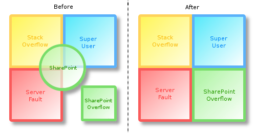
A shopping mall of different expert answer sites, based on the three original sites: Stack Overflow for developers, Server Fault for Systems Administrators, and Super User for power users.

Although Stack Exchange in general is an amazing and reliable resource for getting expert answers on tricky questions, all three of these sites cover slightly different aspects of SharePoint. Deciding which category a problem falls into can be a problem in itself.

If Stack Exchange is a shopping mall; imagine the three original sites as a clothes shop, shoe shop, and an accessory shop. These are all very large and full of useful things, but what about if I’m getting married? The clothes shop has a suit that’s a bit like a morning suit, the shoe shop has some shiny shoes that’ll do the job, and the accessory shop has a likely tophat hidden away at the back (but they’re only selling it “ironically”).

So at the end of this several hour long imaginary trip of rummaging I have something that passes as a suitable outfit. Unfortunately my wife-to-be sighs and points out that I could have done all this at the wedding shop (Shar LaPointe’s Ouverflowe) on the other side of town in a matter of minutes, and I wouldn’t have “I <3 Hatz” written on the front of my tophat.

So, why is this relevant to me?

Well, to get to the point, this is all about getting the wedding shop into the mall where it can be seen by slightly befuddled grooms.

If enough people get together and vote on the proposal, SharePoint Overflow gets it’s own spot in the bustling Stack Exchange community. It will consolidate the SharePoint questions and answers into a single place; becoming much more than the total of the individual sections.

VennSOtoSE

A bigger community also means more and better quality answers for everyone. Even if you don’t ask such questions yourself, helping to bring this project to fruition means your future problem-investigating web searches are more likely to have useful results.

So who gets to vote?

You! Here’s how:

1. Follow this link to Area 51 (the Stack Exchange site proposal site):
SharePoint Overflow on Area 51
2. Press the big “Commit!” button
3. Put in your name, e-mail (there’s no spam or newsletters) and reason for loving SharePoint.
4. Take the next 20 seconds off work; you’ve earned it.