SharePoint Questions: MSDN versus Stack Exchange

Date:October 17th, 2011 Author: Tags: , , , ,
Category: Community, General Comments:7 ;

SharePoint is an enormous heaving behemoth of machinery; full of spinning cogs, churning engines, and peculiar dials. We’ve all worked with parts of it, but not even those that created it understand all of its inner workings.

So where do we go when the wheel that goes ‘whir’ is going ‘squeakity’? Or when we’re having trouble bolting on some shiny new levers? What we need is an expert in that area.

Two likely candidates for finding yourself an expert are:

  • The MSDN SharePoint forums (MSDN): A SharePoint specific branch of the MSDN forums; a staple of the Microsoft Support offering for the past 7 years
  • SharePoint Stack Exchange (SPSE): A community-created sister site to Stack Overflow, whose rebirth into the new Stack Exchange engine (which I’ve blogged about previously) culminated in a re-launch on its 2 year anniversary last month

All about Questions and Answers

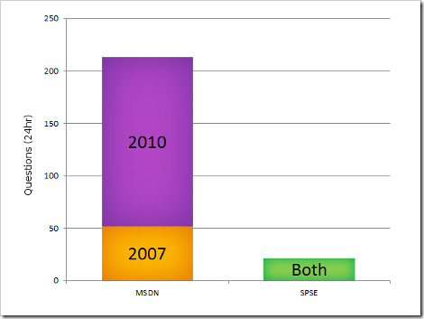
So where does everyone else go to post their questions? A quick glance at the number of questions on each in the last 24 hours* is quite revealing:

MSDNvSPSE questions

The MSDN forums have had over 10 times the amount of questions in the same times period, across its various forums. SPSE is clearly the underdog in terms of its volume of questions, and certainly in terms of traffic.

This is largely unsurprising, as most people will automatically go to Microsoft with their questions, and the MSDN forums are a long-standing staple of the Microsoft support process.

What’s more surprising, is the percentage of questions that are actually answered**:
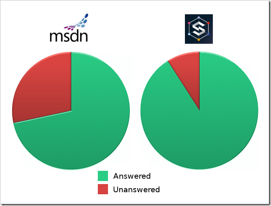
MSDNvSPSE Answered That’s a 64% answer rate on MSDN and a notably higher rate of 91% on SPSE. So why is there such a big difference? This boils down to two factors:

  • The quality of the questions
  • The quality of the answers

Question quality

Part of the difference in answer rate (and question quantity) is the different motivations behind the sites. MSDN’s goal is to help an individual person with their problem, whereas SPSE is built on Stack Exchange’s ethos of building a definitive FAQ on the subject; making it more likely you’ll find an answer to your question without even asking it.

When it comes to asking a question there’s unfortunately very few ways to improve how someone goes about it (short of Internet-based mind control rays). So the question quality is largely determined by how it is handled after it has been posted. This brings us to Moderation:
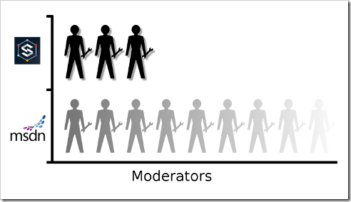
MSDNvSPSE modsThe mysterious fade effect isn’t entirely because I just found the ‘Gradient fill’ button; the MSDN SharePoint forums are moderated by the mysterious and unquantifiable force of Microsoft Support, and an unknown number of community moderators with their own pockets of influence.

In contrast, SPSE is moderated by three recognised members of the community. Much like MSDN’s Forum Issues forum, SPSE has Meta for contacting them, but it also has a chat room that can be used for asking questions about questions.

The final and most important effect on question quality is us (the community). Here are the ways we get involved in this process:

MSDN SPSE
Editing Moderators only Anyone can suggest an edit
High reputation users can approve suggestions
Reporting Anyone can Report Abuse As MSDN, with additional dedicated Review reports and achievements
High reputation users can close questions

This additional community contribution on SPSE has a noticeable effect on the quality of questions. Unfortunately this can lead to a much higher maintenance role for Moderators, which may not translate well to MSDN’s moderation processes.

Answer quality

The biggest factor in answer quality is of course the answerer: The quantity of experts on a site that may know about the problematic area, and the amount of everyday people who may have suffered the same problems in the past.

In terms of quantity, both sites have roughly the same number of responses (~3.5 per question***). Approximately 1.6 of these being proposed answers on SPSE; unfortunately the MSDN proposed answer rate isn’t available (except through checking each one of the 163K questions manually).

An important step is luring and identifying the experts, while also rewarding the everyday contributor:

  MSDN SPSE
Points Recognition points Reputation
Awards Achievements Badges
Incentives MVP and MCC programs Increased site privileges

Although very similar in other respects, the two sites use very different incentive methods. The prestigious MVP award and more commonplace MCC award are highly sought-after by experts (especially aspiring ones), and draw many people to the MSDN forums in search of widely-acknowledged recognition.

The incentives on SPSE take a slightly more understated route: As your reputation increases you become more trusted by the community, and hence the site. This increase in trust gives high-reputation users comparable abilities to moderators, purposefully blurring the boundaries.

Another important step is to make it easy for experts to find questions about their area of expertise. MSDN has 21 forums, each dedicated to a category of SharePoint. Between these forums there is fair bit of overlap, and moving misplaced posts is a continuous battle.

In SPSE the questions are all bundled together on a single page. While this would seem chaotic, the tag system thankfully mitigates most confusion, while allowing more flexibility. However, tags are even more open to misunderstanding and misuse than MSDN’s separate forums, leading to the addition of the ability for medium-reputation users to retag questions.

Which site is best?

As a person with a question, the above pie charts would seem to make it clear that SPSE is the best choice. However, it’s worth mentioning that the comparison is not as straightforward as it seems. Both sites have slightly different means of showing questions as answered, and SPSE has a built-in reputation incentive for marking your question as answered (possibly skewing the results).

As an expert, MSDN is like seeking your fortune in the Big City; you might see your name up in lights, maybe just make an honest living, or you might quietly disappear into anonymity. SPSE is more like staying in your home town; the rewards aren’t as dazzling, but they are more certain and (depending on your community-mindedness) possibly more satisfying.

So what’s the conclusion? Post on both of course! There’s no law against cross-posting questions on both sites, and experts are welcome wherever they go. In time you may find you prefer one or the other (which is likely to be a personal choice) but at least now you know what to expect from each.


*SPSE numbers from Area51 (only overall total available), MSDN posts were manually counted for the 24 hour period prior to 11:00 13/10/11.

**SPSE numbers from Area51, MSDN answered rate based on sum of forum totals on the front page as of 11:00 13/10/11.

***SPSE numbers are from the Data Explorer (sum of comments and answers), MSDN response rate based on sum of forum totals on the front page as of 11:00 13/10/11.

New-SharePoint TeamTime: SharePoint Timesheets to go

Date:September 22nd, 2011 Author: Tags: , ,
Category: SharePoint TeamTime Comments:0 ;

So here’s a new one for you.

SharePoint TeamTime: a nice and easy, ready to use timesheet and time tracking application for SharePoint.

We have been busy working on TeamTime all summer and now it’s very nearly ready to go.

TeamTime is a native SharePoint application pre-built for you to simply add to your SharePoint site and start using with your team.

It offers you two methods of time entry:

  • either a punch card, to let your record time as its happening by stopping and starting a timer,
  • or a traditional grid or timesheet if you prefer to enter all of your time at the end of the day or week.

The team dashboard lets you see who is working on what right now, and to approve time already logged.

Then powerful and customizable reports and analysis give you an overview of work over time to help you answer questions like:

  • What exactly has Bob been doing this month?
  • Who has been working on Project X?
  • How much time are we wasting on meetings?

TeamTime is a bit of a departure for us.  Up until now we have concentrated creating SharePoint components: tools that you can use to help you get more out of SharePoint when building your own sites, applications and dashboards.

One of the great things about SharePoint is the ability it give end users and power users to build their own applications.  It can be great fun to see just what you can achieve with SharePoint and create something that is exactly tailored to your needs and your processes.

But equally sometimes you just need to quickly get your hands on something that just works and instantly solves your business problem, with no time or effort required from you.

Our research into SharePoint End User Adoption showed us that getting a visible “quick win” with SharePoint: using SharePoint to rapidly and visibly address a business pain point can be one of the best ways of jump-starting user adoption of SharePoint.

Our experience with SharePoint Vacation Planner taught us that sometimes you prefer to have someone else map SharePoint functionality on to business processes for you, rather than having to make that journey yourself.

All this made us think that you might welcome a ready to go SharePoint application that addresses one of the most common issues in any business: time tracking.

TeamTime has been built using a combination of out of the box SharePoint functionality and customized versions of our own web parts: PivotPoint and FilterPoint.  The development has provided us with some new challenges, particularly in the area of user interface design where we have had far more scope to express our creativity that we normally get when building components.  Could be dangerous!

Working our own components in to TeamTime has also given us a fresh perspective on them and some improvements have resulted – watch this space for a new version of FilterPoint.

We are now in the final stages of development and testing with TeamTime and the final version will be released very soon.

If you’d like to give it a whirl with our 30 day free trial then sign up here.

Thinking Sideways About Highlighter

Date:September 15th, 2011 Author: Tags: , , , , ,
Category: Highlighter, SharePoint Ideas Comments:0 ;

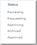
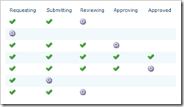
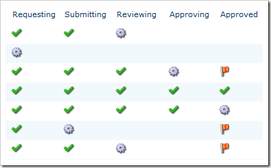
You may have caught Clare’s post earlier about Highlighter’s recent performance enhancements, that were mostly due to some of the surprising ways we’ve seen it being used in the wild. To illustrate this sideways thinking (lateral and literal) we’ll take a look at exploding a humble status column into an Approval Progress Overview:

Status overview

As you can see, we now have a quick at-a-glance idea of how the projects are doing. To create this view, a Highlighter column has been added for each of the statuses. In each of these columns we’ve set it up to display icons (cell color is also a good choice), and cleared the default. Let’s take the Approved status as an example:

Icon setup

All we need to do is click the Auto-create button to create some rules, remove those for the earlier statuses, change the later ones to green icons, and this column’s status of interest to a working icon:

Rules

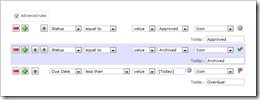
Just to keep people on their toes lets add a little urgency to the list with a Due Date column. So now we want to change the Approved column to a red icon if the Due Date has passed, and the status isn’t yet Approved. This is done by switching to Advanced mode and adding a single rule:

Due date rule

Here are the results of that extra change:

Overview (with due date)

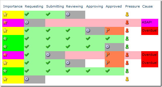
If that wasn’t enough for you, here’s the weaponized version of Highlighter featuring cell colors, priority icons, and Project Manager Blood Pressure indicator:

weaponised

We’re always interested to hear what you’ve done with our products (especially Highlighter); so if you’ve done something even scarier than the above, send a screenshot to [email protected].

How to Create a SharePoint “Does Not Begin With” Filtered List View

Date:September 9th, 2011 Author: Tags: , , ,
Category: Calculated Columns, Filter Comments:6 ;

Wonderful though SharePoint is most of the time, occasionally it just lets you down at the most unexpected moment.

So, last week, I wanted to look at a list of all of our sales that were not made to organizations in the USA.

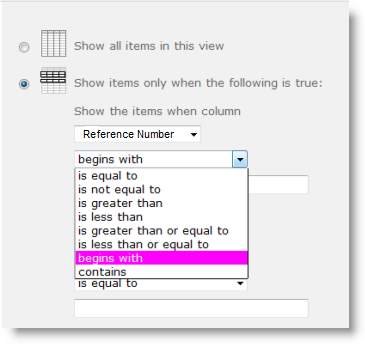
Simple I thought, since all our sale reference numbers start with a 3 letter country code I shall just create a view for all records where Reference Number does not begin with “USA”

So, create a new view, off we go:

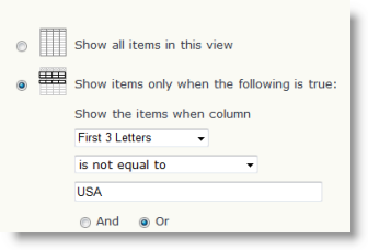
Oh dear, we have an option for “begins with” and “contains” but nothing for “does not begin with” or “does not contain”. How disappointing!

So, quick call to Ryan, the king of the calculated column, and we have a handy workaround which seemed worth sharing with you.

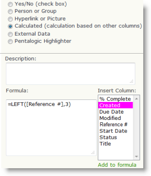
Create a calculated column using the following formula which will just display the first 3 letters of the reference code – call it something like “First 3 letters”.

=LEFT([Reference Number],3)

Then create a view with a filter:

WHERE “First 3 Letters” “Is not equal to” “USA”

Easy as that!

You can use this method to create a view for:

  • Does not begin with
  • Does not end with (using the RIGHT instead of LEFT function)

“Does not contain” is a tad more complicated but can be achieved by using the SEARCH function. So in our example

SEARCH("USA",[Reference #],1)

Will return the first position of USA in an entry in the Reference Number field, or an error if it can’t be found.

So combining this calculated column:

=ISERR(SEARCH("USA",[Reference #],1))

Which gives “Yes” where it returns an error ( “does not contain”) and “No” where “USA” is found, with a filtered view with shows only “Yes” results, will give you records which do not contain USA.

See our Calculated Column Cheat Sheet for these and other useful formulas.

Hope this helps, and if you have any suggestions for other calculated column ninja moves we would love to hear them.

SharePoint Staff Vacation Planner Update – dealing with Public Holidays

Date:September 1st, 2011 Author: Tags: , , , ,
Category: PivotPoint Web Part, SharePoint Planner, SharePoint Reminder Comments:0 ;

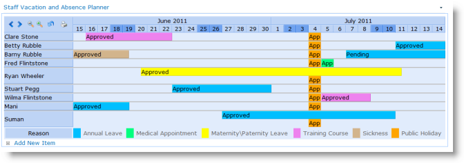
Customers who use our SharePoint Staff Vacation Planner Toolkit often ask about the best way to deal with public holidays.  Public Holidays tend to affect the whole team.  So you want them clearly marked on your Vacation Planner dashboard, but you certainly don’t want to have to enter each public holiday for each team member as a separate event.  And you probably also don’t want to be firing off absence approval requests for each holiday either.

So here are our suggestions on the best way of handling Public Holidays within the SharePoint Staff Vacation Planner Toolkit.

First you need modify your list.  Go to list settings and open up your “Reason” field.  In addition to your existing reasons for absence add a new reason – Public Holiday.

Then open up the settings for your “Requested By” column and make sure you have “Allow Multiple Selections” checked.

Now you need to modify your Planner web part.

So, “Edit Shared Web Part” then, under your “Category”  picker, check the “split multiple selections box”.  This is key if you want to be able to create just one event for each public holiday but have it show up against each of your team members.

Now go down to the Planner Colors section of the Toolpart and update your color coding by column section to include an extra color code for your new Reason for absence that you created in your list – Public Holiday – I am going for a nice orange.

Now check your PivotPoint web part. For this to work you are going to need PivotPoint 2.1.4 or above.  Download it here if you don’t have it already (free to all PivotPoint v2 customers, or v1 customers with Premium Support). In the Toolpart make sure that in the “Split Multiple Values” dropdown you have chosen “Split Records”.  This will ensure that when we enter a 1 day public holiday for 4th of July, for example, 1 day gets entered against each team member in the pivot table.

Finally, before we start adding events, to ensure that we don’t accidentally fire off approval requests and notifications all over the place, access the Reminder web parts that you have set up and in the “Reminder Testing”  section at the bottom of the Toolpart enter your own email address so that any emails generated whilst you are adding the public holidays go to you.  This will be a better solution than simply switching the Reminders off as you work, as it will mean that if any “real” requests are submitted whilst you are working you will be able to redirect them, rather than them being lost.

Add a Public Holiday

So, from your Planner dashboard add a new item.  Let’s do 4th July. Set it up as an all day event.  Set yourself as “approved by”, you will need to approve the event before it will show up in people’s dashboards.  Now add your whole team to the “Requested By” field.  It’s easiest to do this using the Address Book.  Now ensure you have selected “Public Holiday” in your Reason field.  Approve the request.  Discard all the “Request approved” notifications that are redirected through to you.  And now you will see your public holiday, nicely marked against each of your team members.  Repeat as needed for all of your other public holidays, remove the redirect from your Reminder emails and then you can relax for another year!

I hope this helps you in using Vacation Planner.  If you have any questions or requests about the Vacation Planner we would love to hear them.

PivotPoint for SharePoint – New version Released v2.1.5

Date:August 31st, 2011 Author: Tags:
Category: General, PivotPoint Web Part Comments:0 ;

Only last month we launched PivotPoint v2, which added charting and drill down to this popular SharePoint tool.

Now we are releasing v2.1.5 which has some pretty nifty new features added as a result of your feedback on v2.

Axis Minimum

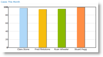
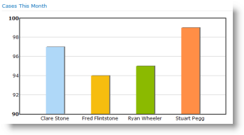
You pointed out that when looking at a chart, if all of your values are bunched between say 90 and 100, viewing them on an axis that runs from 1 to 100 doesn’t make things all that easy to read.

So the new Axis Minimum option lets you choose where your axis starts (in the example above this would be 90) making charts that much easier to read.

Split Multiple Values

In PivotPoint v2 we had disabled the option of using a multi-choice column. We felt that in most circumstances this simply didn’t make sense as an option within a Pivot Chart or Table.  But you disagreed, so we put the option to work with multi-choice fields back in and we think we have come up with a way of making it more usable.
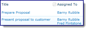
So for example, take a simple task list – where as you can see the “Present Proposal” task is assigned to multiple people – Barry and Fred.

In your Pivot Table or chart you can choose to either treat your multi-choice record as a single record, effectively creating a new category in the Pivot Table, like this:

Or you can choose to split the multi-choice record between all the choice categories (in this case people) in it, like this:

If you choose to split multiple choice records between their multiple parts the full value of the record is allocated to each of its choices.

This brings PivotPoint in to line with the way that SharePoint Planner works, so will be especially useful for people who use dashboards with both Planner and PivotPoint deployed, and will also be very useful for our Vacation Planner users – watch this space for an update on how this is going to help you.

Allow Custom Field Types

Custom fields can cause all sorts of trouble, so previously we had simply outlawed them in PivotPoint in an effort to try and keep things simple.  However quite a few of you have said you wanted to be able to use custom fields, so we have now allowed you to enable this feature.

Be warned though, not all types of custom field will work correctly in PivotPoint (depending on their design) and we won’t be able to provide support on 3rd party custom fields.

Full information on all of these changes can be found in the PivotPoint manual.

Getting the Latest Version

PivotPoint v2.1.5 is free to download for anyone who has previously purchased PivotPoint v2, or PivotPoint v1 plus Premium Support.

Existing customers can download the latest version here.  The new version can be installed directly over the top of the old, and you will retain all of your existing web part settings.

For those of you using PivotPoint on a 30 day free trial, you can upgrade to the new version here, your trial will continue and you will retain any web parts you have set up already.

We hope you find these new features useful and we would love to hear your feedback on them, or any other aspects of PivotPoint v2.

SharePoint Planner – New Version Release, every minute counts!

Date:August 25th, 2011 Author: Tags: , , ,
Category: General, SharePoint Planner Comments:0 ;

We were recently contacted by a customer who was going to be responsible for organizing a visit from a Very, Very important person. The visit would only last a couple of hours, but would involve many people and needed to be planned down to the minute.

The client wanted an easy to use graphical representation of the project, in SharePoint, for everyone to refer to and update as the event progressed.

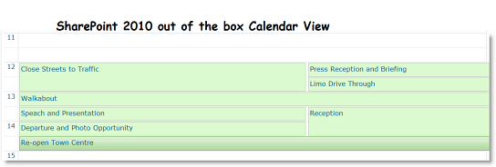
Let’s take a look at how the project might have looked in an out of the box calendar view:

Hmmm, don’t think that’s really giving us the kind of info we need.  We have 7 items here, scheduled over a 3 hour period from 12 noon to 3pm, items fall in to different categories and are assigned to different people.  We’re not really getting that from this view are we?

Actually, the view is quite misleading.  The first event “Close Streets to Traffic” looks as though it lasts for one hour from 12.00 to 13.00 right? Wrong, this is actually a 40 minute event, starting at 12 and finishing at 12.40.  This may not seem like a big deal but there are times when this kind of accuracy really matters – it’s easy to see how running 20 minutes late at a VIP event could lead to VIP tantrums!

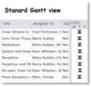
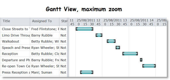
So how about the out of the box Gantt Chart? OK, so we have access to a little more info on who is doing what, but now we can see nothing at all on timings.

We can zoom though, and this is what we get when we do maximum zoom.

Well it’s certainly an improvement, but it’s not great is it?  We are on maximum zoom here are it’s still quite difficult to see the detail of what’s happening when.

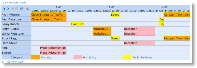
We thought we could do better.  So we added to SharePoint Planner the ability to set timescales to 10 or 15 minutes.  We think this gives a much clearer view for fast moving projects like this. Either in the classic Gantt view, most usually used for projects: Or in a category view for exactly what each of your team members should be doing at any one time:

The new 10 and 15 minute scheduling options allow you to schedule events more accurately and deploy resources more effectively.

This is a new feature in Planner version 2.6.6, so if you are using an older version of the software it would be worth upgrading now.

Or if you don’t yet use SharePoint Planner why not give it a try today with 30 day free trial?

How not to develop a SharePoint [Today] Calculated column

Date:August 22nd, 2011 Author: Tags: , ,
Category: Calculated Columns, Highlighter, Training Comments:4 ;

After developing SharePoint Highlighter, we seriously considered expanding on this area with a Calculated Column that would allow you to use [Today] in the formula. If you’re thinking “But you can already!” I suggest looking at Ryan’s article about the [Today] column trick.

Needless to say, this would be a very useful tool for almost any SharePoint user. After much researching and prototyping we came to an unfortunate conclusion: Although it was possible to make a Custom Field Type to do this, it was almost certainly impractical (certainly for us).

The avenues we investigated finished in three types of dead-end:

  • Brick wall: A completely impassable system limitation.
  • Overgrown with brambles: Nothing but pain for all involved.
  • Swamps: A long unpleasant slog, with an uncertain outcome.

The Brick Wall

The first thought in any developer’s mind when making a variation on a class should be “Inherit it”. It allows you to take advantage of the existing class’ methods with minimal difficulty and yet offers (almost) total control over its behaviour.

Attempting to do so will reward you with the slightly misleading error:

The type ‘Microsoft.SharePoint.SPFieldCalculated’ has no constructors defined

A brief search in the MSDN documentation for SPFieldCalculated shows that the absence of public constructors is intentional:

Windows SharePoint Services 3.0 does not support inheriting from this class.

And so this avenue ended in a brick wall. More worryingly; disallowing the inheritance of a class is usually a sign that something so heinous is happening inside that Microsoft doesn’t want it reproduced.

Brambles

Intrigued by the promise of horrifying creatures dwelling within, I had a look inside the class to see what was happening (using my own powers of code intuition, and not any kind of questionable reverse engineering method).

It seems the actual calculations take place outside of the SPFieldCalculated class, using instead a call to SPRequest. This new lane of research quickly ended in spiky brambles, as using a direct call to SPRequest would make our product (and hence anything it’s installed on) unsupported by Microsoft.

Undeterred, I took inspiration from the billing system at my old work and looked at keeping the ‘black box of calculation mystery’ class running in the background, with the new class acting as a wrapper around it.

Creating a Custom Field Type that kept a hidden field for data storage in the background was an architecture we’d experimented with when creating Highlighter, so adding a relatively minor call to update the formula with the current date and time seemed quite easy.

The thorny ending in this case was the enormous potential server load; updating the formula every time the list was viewed (to keep it up to date) caused the entire list’s worth of calculations to be refreshed. Viewing just 20 items would make up to 5000 items recalculate their values for each of our columns on the view.

Swamps

The final and most desperate option was to do it ourselves: Completely rewrite all or a subset of the calculated column functions, and handle the associated function nesting.

I’m DIM: Doin’ It M’self.

Following this path would mean wading through the boggy and unpleasant process of exactly reproducing Microsoft’s function calls; avoiding the murky bottomless pools of performance issues. All the while hoping we wouldn’t run into any of the hungry and sharp-toothed show stoppers along the way.

As you may have guessed, we didn’t venture down this path.

Why are you telling me all this?

Because although these paths aren’t available to us as an ISV, it doesn’t mean they aren’t options to you (except the brick wall, of course).

Brambles: Using SPRequest is unsupported, but if this doesn’t deter you then this is still very much an option. Similarly, if you have an abundance of processing power (or really need a space heater in your server room) performing complete column recalculations on every view shouldn’t bother you.

Swamps: If you have very specific requirements you could get away with only recoding a few functions, which would greatly reduce the chances of you disappearing forever. Alternatively, if you have a large herd of idle developers you could set about recreating the whole set. However, I doubt this is a serious option for anyone except the head of the Microsoft Silverlight team.

SharePoint Highlighter – color coding date ranges based on [Today]

Date:August 17th, 2011 Author: Tags: , , ,
Category: General, Highlighter, SharePoint Ideas Comments:2 ;

It is sooo much easier to keep on top of your tasks if you can see at a glance what is due when.

Tasks Highlighted by due date


It’s easy to add this color coding to your SharePoint lists with SharePoint Highlighter in just a few clicks, but setting up the rules correctly is a bit of a mind-bender, so in this post we are going to show you how.

So above you can see:

  • Tasks due in less than 7 days highlighted in orange
  • Tasks due in 7-14 days highlighted in yellow.
  • Tasks due in more than 14 days highlighted in green.

So first add a Highlighter column to your list:

http://www.pentalogic.net/sharepoint-products/highlighter/h-manual/h-configuration

Give it a name – I’ve called mine “Due When”.

From the 3 Highlighting Styles choose Highlighting, and choose to Highlight Rows, though this method would work equally well with icons or cell highlighting.

As we are highlighting the whole row we don’t really need to see the actual Highlighter column, so choose to put this to the right of the view, out of the way.

If we were using Auto Setup Rules we would now base the Highlighter column on your Due Date column – this is where it would get its information from.  But what we want to do is a bit too complex for the Auto Setup, so you can leave this box blank and go straight to to the Advanced Rules – click Add Custom.

Scary!  Not really, we just need to think logically about when we are trying to achieve.

The main thing you need to remember is that Highlighter will apply the first rule it finds that is true.  Once it has applied one rule to a row, it will ignore all other rules.

So to get the Highlighting shown above we need this setup:

So, when Highlighter checks the list, first it checks to see if the item’s due date is less than 7 days after today, if it is Highlighter colors the row orange and moves on to check the next list item.  If this rule isn’t met Highlighter checks to see whether the item’s due date is less than 14 days after today, and so on.

It’s all a matter of getting your rules in the right order.  So for example, if we change the order of the rules so the 14 day rule comes first, like this:

This is what happens to the list:

As you can see we have lost our orange highlighting for items that are “Due in Less than 7 days”.  Because Due in less than 14 days is now at the top of our list of rules this is what Highlighter is checking for first, so it is missing the more urgent items.

It’s all about getting your rules in the right order, and as you can see, Highlighter gives you the ability to move items up and down the list with the up/down arrows, or insert or delete a rule at any point.

I hope this has helped to make sense of the advanced rules, and if you have any scenarios that you would like us to work through for you then we would love to hear from you.

Show Actual v Target Performance in SharePoint with PivotPoint web part.

Date:August 3rd, 2011 Author: Tags: , ,
Category: General Comments:0 ;

So we all like to know how we are doing – hitting our targets, meeting our KPI’s, staying within our budgets, running out of vacation days.

If you record things like this in SharePoint lists you would hope it would be easy enough to see how your actual performance compares to your targets, budgets or KPI’s.

Well for those of you who have Enterprise  and PerformancePoint it is possible – if not exactly a walk in the park –  but for the rest of us this can be a tricky task.   You need to find a way of bringing together 2 different sets of data:

  • Target or KPI – which is one item of data, which stays constant – no one likes a moving target do they?
  • and an “Actual” figure which is the sum of a number of list items – sales, purchases, leave bookings, whatever, and which will clearly change as list items are added and changed.

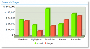
So if we were looking to compare Target and Actual sales for July, as in the chart above, the date would loook like this.  A list of sales items, which will grow as the month progresses, producing a changing Actual total,  and one Target item, which will stay the same throughout the month.

These two data sets would generally live in separate lists.  The way many KPI columns work is by getting you to manually enter – and manually update – your changing Actual total into your Target list.  Not great, as you never get to see how the situation is changing until you have done your manual update.

In a workaround for one of our PivotPoint customers we have turned this on method on its head – entering the static “Target” into the ~Actuals list (in this example the sales list) to allow you to produce a chart or table with our PivotPoint web part, which will show actuals vs targets and is updated as your actual data changes, without the need for manual intervention.

So here’s how.

Add a new column to your list.  Make it a choice column with the choices as “Actual” and “Target”.  Have it default to actual, as this is what the vast majority of items are going to be.

Then we simply enter a “Target” item for each category we want to compare.  So in this example I want to see actual vs target sales for each of my products. So I have entered a Target Sales item for each of my products for July.

As the month goes on my team will enter actual sales for July, which will (hopefully) start to stack up nicely against my target.

So to see how things are shaping up set up a PivotPoint, get it to watch the sales list, and in this case a “This Month” view of the sales list.  Display a Pivot Chart, in this case a column chart.

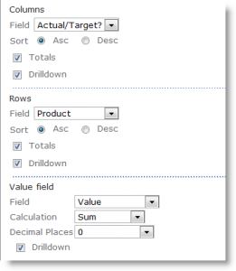
To see the actual sales vs target sales set it up like this:

  • Get your column data from the Actual/Target field.
  • Your Row data from the product field.
  • And your values from the Value field.

And you should end up with a nice column chart like the one above.

The best bit about this is that your chart will update as your list data changes.  So let’s say I get a really huge Planner order:

Woohoo – you can take that to the bank!

So, it’s not perfect, it’s a workaround, but some of you might find it useful.

Places you could use this would include:

  • Sales vs Target
  • Budget vs actual expenditure
  • Annual Vacation Allocation vs Vacation taken to date.

If you have any other ideas on where this might be useful we would love to hear them.