Posts Tagged ‘PivotPoint’

SharePoint Pivot Charts and Pivot Tables with New PivotPoint v2

Date:July 8th, 2011 Author: Tags: ,
Category: General, PivotPoint Web Part Comments:0 ;

Eagerly awaited v2 of PivotPoint web part for SharePoint is now available for you to try, or buy.
We think you’re going to like this one.

Some of you will be familiar with PivotPoint already; it lets you summarize complex SharePoint list data by creating Pivot Tables.  These update dynamically, as your list data changes. So they are great to use in dashboards for things like keeping an eye on how sales are going, keeping tabs on how your helpdesk is performing, seeing who’s taking way too much sick leave.

People in the finance sector and statisticians have always been really keen on PivotPoint; they understand how useful Pivot Tables are and feel right at home looking at rows of figures all day.  For the rest of us  a nice colourful chart tends to make things easier to understand at a glance, so that’s what we have added to PivotPoint version 2.

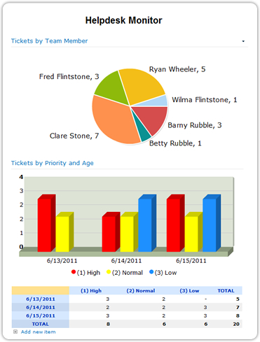
As well as creating Pivot Tables, which are linked directly to your SharePoint list data and therefore update automatically as your list data changes, you can also create Pivot Charts, which are also linked directly to the list.  You can choose bar charts, line charts, column charts, funnels, pies – the world’s your oyster!  Color code as you wish, and if you want the visualisation and the detail you can display a chart and a table together.

Another advantage of having the web part directly connected to the list is that we have been able to include drill down, from the chart or table, to a filtered view of the list.  So for example when I am looking at my “Sales by Product, This Month”, chart, I will be able to hover over the enormous, sky rocketing column which represents this month’s sales for PivotPoint version 2, click on it, and go directly to a list view showing just the sales records for all the people who have bought PivotPoint this month – how cool is that?

The new version also has other handy features, like export to excel, so that you can do more analysis on your figures if needed, and easy printing, because we know SharePoint generally isn’t all that print friendly.

If you are an existing customer you can upgrade to v2 without disrupting any of your existing settings.

If you’re not a customer yet, well what are you waiting for?  Take a free trial and see what your SharePoint deployment is missing!

SharePoint Charting in PivotPoint – Coming Soon!

Date:April 13th, 2011 Author: Tags: ,
Category: General, PivotPoint Web Part Comments:0 ;

I am sure you have noticed that there is a lot going on here at Pentalogic lately.  Just a couple of months ago we launched FilterPoint, which brings fast, flexible filtering to SharePoint lists and web parts.  Then we unveiled SharePoint Highlighter which gives you a whole range of color coding, icons and effects to brighten up your lists.  And our new free tool View Rescue sorts out an annoying niggle for SharePoint 2010 users.

But we haven’t forgotten our existing products.  Feature requests for Planner, Reminder and PivotPoint come in from customers all the time and new versions of all 3 are planned for the coming months.

First off the blocks is PivotPoint with the new version out by May.  We are very excited about this and we hope you will be too.

PivotPoint v2 includes a host of handy new features like drill down form the Pivot table to relevant list items, the handy “Add New” button which Planner users will be familiar with at the bottom of the display, and charts and graphs.

The charting and graphing functionality will mean that you will be able to choose to view bar, line, pie. Column and area charts as well, or instead of the traditional Pivot table.

We think that this is really going to bring dashboards to life – imagine your Sales Team being able to view “Sales to Date” as a dynamic color bar chart, generated straight from the SharePoint list?  Or the Helpdesk viewing a pie chart of current open requests by status, or age?

We have always thought PivotPoint was pretty nifty:  it’s the only tool we know of that applies Pivot Table, or Cross Tabulation functionality directly to SharePoint lists.  But as they say, a picture speaks a thousand words (or in this case should it be numbers?) and we think that when you see the charts PivotPoint can produce directly from SharePoint lists, you are going to wonder how you ever managed without it.

PivotPoint v2 will be available in the next few weeks.  For immediate notice of the release subscribe to the blog RSS feed, or email me at: [email protected]

Why Tooltips are cool tips in PivotPoint Webpart for SharePoint

Date:September 9th, 2010 Author: Tags: , , ,
Category: PivotPoint Web Part, SharePoint webparts Comments:0 ;

Tooltips  – those little boxes that pop up when you hover over something – can be a blessing or a bit of a nightmare.  It drives me nuts when people enable those snapshot tooltips on every hyperlink on a page.  the resulting pop ups are huge, usually contain info I don’t want to see, and seem to hang around on the screen for ever.

But imagine a tooltip where you choose exactly what information is displayed?  How cool would that be?  Well that’s exactly what you get with tooltips in our PivotPoint web part  for SharePoint – which is why I think they rock.

(more…)

SharePoint Case Study – Websense Pivot Through Their Marketing Dashboards

Date:September 6th, 2010 Author: Tags: , ,
Category: General, PivotPoint Web Part, SharePoint webparts Comments:0 ;

Hi everyone.

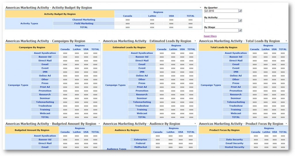
We wanted to share this new SharePoint case study with you.  It shows how online security specialists Websense are using our PivotPoint webapart to slice and dice their marketing list data, and create some awesome, dynamic dashboards.

(more…)

SharePoint Staff Vacation Planner – DIY Guide part 3 – set up an Absences to Date Dashboard

Date:August 4th, 2010 Author: Tags: , , ,
Category: General, PivotPoint Web Part, SharePoint Ideas Comments:0 ;

This is Part 3 of the SharePoint Staff Vacation Planner – DIY Guide

So having set up our basic SharePoint list with filtered views, and our “Wall Chart” dashboard, using SharePoint Planner webpart, we are now ready to get up our “Staff Absences to date” and “My Absences” dashboards.  This is the bit that allows managers to monitor the amount of absence each of their team members has had:

Or for individual staff members to monitor their own absences:

(more…)

New SharePoint Partnership – Pentalogic and LookOut Software

Date:April 9th, 2010 Author: Tags: , , , ,
Category: General, Partners Comments:0 ;
We are really pleased to let you know about our latest Strategic Partnership with a SharePoint relationship management development company, LookOut Software of Vancouver, British Columbia, Canada. Lookout_logo_sml


LookOut has been in the CRM software business since 1994.  In 2007 they were introduced to SharePoint and made the decision to change development platforms and haven’t looked back since.

(more…)

New Pricing

Date:January 4th, 2010 Author: Tags: , , ,
Category: General, PivotPoint Web Part, SharePoint webparts Comments:0 ;

If you have visited our website recently you may have noticed that we have changed our pricing.  Just a quick note here to explain what we have done and why.

Firstly we wanted to simplify the pricing of Reminder.  People often commented on how confusing the licensing structure was with a combination of server licenses and web part license packs.  So we have simplified this and also reduced the price, so that the price of Reminder now falls more in line with the pricing of other Alert enhancement web parts on the market.

pricegrid

Across all of our products we have also introduced 2 new pricing options, which we hope will help to make our software more affordable for a lot of customers.

(more…)

Getting Cross (Tab)

Date:September 9th, 2009 Author: Tags: , ,
Category: General, PivotPoint Web Part, SharePoint webparts Comments:0 ;

Update: CrossTab has been renamed PivotPoint

Our newest web part for SharePoint is a data analysis tool called “CrossTab”

We really like it: it works a bit like an Excel pivot table but has some extra functionality that helps you to unlock the data patterns and trends in SharePoint lists.

But nobody except us seems to get it.  So we have prepared a quick video demo to show you how it works.

(more…)