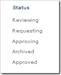
You may have caught Clare’s post earlier about Highlighter’s recent performance enhancements, that were mostly due to some of the surprising ways we’ve seen it being used in the wild. To illustrate this sideways thinking (lateral and literal) we’ll take a look at exploding a humble status column into an Approval Progress Overview:
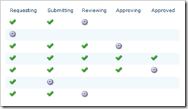
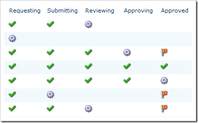
As you can see, we now have a quick at-a-glance idea of how the projects are doing. To create this view, a Highlighter column has been added for each of the statuses. In each of these columns we’ve set it up to display icons (cell color is also a good choice), and cleared the default. Let’s take the Approved status as an example:
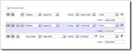
All we need to do is click the Auto-create button to create some rules, remove those for the earlier statuses, change the later ones to green icons, and this column’s status of interest to a working icon:
Just to keep people on their toes lets add a little urgency to the list with a Due Date column. So now we want to change the Approved column to a red icon if the Due Date has passed, and the status isn’t yet Approved. This is done by switching to Advanced mode and adding a single rule:
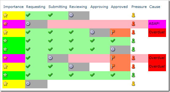
Here are the results of that extra change:
If that wasn’t enough for you, here’s the weaponized version of Highlighter featuring cell colors, priority icons, and Project Manager Blood Pressure indicator:
We’re always interested to hear what you’ve done with our products (especially Highlighter); so if you’ve done something even scarier than the above, send a screenshot to [email protected].
Tags: Dashboard, Icon, Indicator, KPI, SharePoint, SharePoint Highlighter


