Archive for the ‘PivotPoint Web Part’ Category

PivotPoint for SharePoint – New version Released v2.1.5

Date:August 31st, 2011 Author: Tags:
Category: General, PivotPoint Web Part Comments:0 ;

Only last month we launched PivotPoint v2, which added charting and drill down to this popular SharePoint tool.

Now we are releasing v2.1.5 which has some pretty nifty new features added as a result of your feedback on v2.

Axis Minimum

You pointed out that when looking at a chart, if all of your values are bunched between say 90 and 100, viewing them on an axis that runs from 1 to 100 doesn’t make things all that easy to read.

So the new Axis Minimum option lets you choose where your axis starts (in the example above this would be 90) making charts that much easier to read.

Split Multiple Values

In PivotPoint v2 we had disabled the option of using a multi-choice column. We felt that in most circumstances this simply didn’t make sense as an option within a Pivot Chart or Table.  But you disagreed, so we put the option to work with multi-choice fields back in and we think we have come up with a way of making it more usable.
So for example, take a simple task list – where as you can see the “Present Proposal” task is assigned to multiple people – Barry and Fred.

In your Pivot Table or chart you can choose to either treat your multi-choice record as a single record, effectively creating a new category in the Pivot Table, like this:

Or you can choose to split the multi-choice record between all the choice categories (in this case people) in it, like this:

If you choose to split multiple choice records between their multiple parts the full value of the record is allocated to each of its choices.

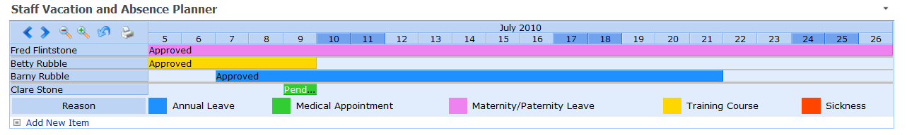
This brings PivotPoint in to line with the way that SharePoint Planner works, so will be especially useful for people who use dashboards with both Planner and PivotPoint deployed, and will also be very useful for our Vacation Planner users – watch this space for an update on how this is going to help you.

Allow Custom Field Types

Custom fields can cause all sorts of trouble, so previously we had simply outlawed them in PivotPoint in an effort to try and keep things simple.  However quite a few of you have said you wanted to be able to use custom fields, so we have now allowed you to enable this feature.

Be warned though, not all types of custom field will work correctly in PivotPoint (depending on their design) and we won’t be able to provide support on 3rd party custom fields.

Full information on all of these changes can be found in the PivotPoint manual.

Getting the Latest Version

PivotPoint v2.1.5 is free to download for anyone who has previously purchased PivotPoint v2, or PivotPoint v1 plus Premium Support.

Existing customers can download the latest version here.  The new version can be installed directly over the top of the old, and you will retain all of your existing web part settings.

For those of you using PivotPoint on a 30 day free trial, you can upgrade to the new version here, your trial will continue and you will retain any web parts you have set up already.

We hope you find these new features useful and we would love to hear your feedback on them, or any other aspects of PivotPoint v2.

SharePoint Pivot Charts and Tables – Quick and Easy Video Demo

Date:July 15th, 2011 Author: Category: General, PivotPoint Web Part, SharePoint Ideas Comments:0 ;

It’s all too easy to say that a piece of software is “intuitive” or “Quick and Easy” to use. But what’s quick and easy for me could quite possibly be mind bogglingly slow and tricky for you.

So to show you just how quick and easy it really is to set up dynamic Pivot charts and tables in SharePoint using PivotPoint web part we have produced a 4 minute video demo which walks you through the set up.

The video:

  • walks you through setting up a pivot chart from SharePoint list data,
  • shows you how the chart or table you have created provides a drill-down to a filtered view of your list data, and
  • shows you how your charts and tables update dynamically as you list data changes.

Take a look and if you think you could make use of PivotPoint on your SharePoint site why not try it out with a 30 day free trial.

SharePoint Pivot Charts and Pivot Tables with New PivotPoint v2

Date:July 8th, 2011 Author: Tags: ,
Category: General, PivotPoint Web Part Comments:0 ;

Eagerly awaited v2 of PivotPoint web part for SharePoint is now available for you to try, or buy.

We think you’re going to like this one.

Some of you will be familiar with PivotPoint already; it lets you summarize complex SharePoint list data by creating Pivot Tables.  These update dynamically, as your list data changes. So they are great to use in dashboards for things like keeping an eye on how sales are going, keeping tabs on how your helpdesk is performing, seeing who’s taking way too much sick leave.

People in the finance sector and statisticians have always been really keen on PivotPoint; they understand how useful Pivot Tables are and feel right at home looking at rows of figures all day.  For the rest of us  a nice colourful chart tends to make things easier to understand at a glance, so that’s what we have added to PivotPoint version 2.

As well as creating Pivot Tables, which are linked directly to your SharePoint list data and therefore update automatically as your list data changes, you can also create Pivot Charts, which are also linked directly to the list.  You can choose bar charts, line charts, column charts, funnels, pies – the world’s your oyster!  Color code as you wish, and if you want the visualisation and the detail you can display a chart and a table together.

Another advantage of having the web part directly connected to the list is that we have been able to include drill down, from the chart or table, to a filtered view of the list.  So for example when I am looking at my “Sales by Product, This Month”, chart, I will be able to hover over the enormous, sky rocketing column which represents this month’s sales for PivotPoint version 2, click on it, and go directly to a list view showing just the sales records for all the people who have bought PivotPoint this month – how cool is that?

The new version also has other handy features, like export to excel, so that you can do more analysis on your figures if needed, and easy printing, because we know SharePoint generally isn’t all that print friendly.

If you are an existing customer you can upgrade to v2 without disrupting any of your existing settings.

If you’re not a customer yet, well what are you waiting for?  Take a free trial and see what your SharePoint deployment is missing!

SharePoint Charting in PivotPoint – Coming Soon!

Date:April 13th, 2011 Author: Tags: ,
Category: General, PivotPoint Web Part Comments:0 ;

I am sure you have noticed that there is a lot going on here at Pentalogic lately.  Just a couple of months ago we launched FilterPoint, which brings fast, flexible filtering to SharePoint lists and web parts.  Then we unveiled SharePoint Highlighter which gives you a whole range of color coding, icons and effects to brighten up your lists.  And our new free tool View Rescue sorts out an annoying niggle for SharePoint 2010 users.

But we haven’t forgotten our existing products.  Feature requests for Planner, Reminder and PivotPoint come in from customers all the time and new versions of all 3 are planned for the coming months.

First off the blocks is PivotPoint with the new version out by May.  We are very excited about this and we hope you will be too.

PivotPoint v2 includes a host of handy new features like drill down form the Pivot table to relevant list items, the handy “Add New” button which Planner users will be familiar with at the bottom of the display, and charts and graphs.

The charting and graphing functionality will mean that you will be able to choose to view bar, line, pie. Column and area charts as well, or instead of the traditional Pivot table.

We think that this is really going to bring dashboards to life – imagine your Sales Team being able to view “Sales to Date” as a dynamic color bar chart, generated straight from the SharePoint list?  Or the Helpdesk viewing a pie chart of current open requests by status, or age?

We have always thought PivotPoint was pretty nifty:  it’s the only tool we know of that applies Pivot Table, or Cross Tabulation functionality directly to SharePoint lists.  But as they say, a picture speaks a thousand words (or in this case should it be numbers?) and we think that when you see the charts PivotPoint can produce directly from SharePoint lists, you are going to wonder how you ever managed without it.

PivotPoint v2 will be available in the next few weeks.  For immediate notice of the release subscribe to the blog RSS feed, or email me at: clare.stone@pentalogic.net

Why Tooltips are cool tips in PivotPoint Webpart for SharePoint

Date:September 9th, 2010 Author: Tags: , , ,
Category: PivotPoint Web Part, SharePoint webparts Comments:0 ;

Tooltips  – those little boxes that pop up when you hover over something – can be a blessing or a bit of a nightmare.  It drives me nuts when people enable those snapshot tooltips on every hyperlink on a page.  the resulting pop ups are huge, usually contain info I don’t want to see, and seem to hang around on the screen for ever.

But imagine a tooltip where you choose exactly what information is displayed?  How cool would that be?  Well that’s exactly what you get with tooltips in our PivotPoint web part  for SharePoint – which is why I think they rock.

(more…)

SharePoint Case Study – Websense Pivot Through Their Marketing Dashboards

Date:September 6th, 2010 Author: Tags: , ,
Category: General, PivotPoint Web Part, SharePoint webparts Comments:0 ;

Hi everyone.

We wanted to share this new SharePoint case study with you.  It shows how online security specialists Websense are using our PivotPoint webapart to slice and dice their marketing list data, and create some awesome, dynamic dashboards.

(more…)

SharePoint Staff Vacation Planner – DIY Guide part 5 – the system in action and Out of the box options.

Date:August 9th, 2010 Author: Tags: , ,
Category: PivotPoint Web Part, SharePoint Ideas, SharePoint Planner, SharePoint Reminder, SharePoint webparts Comments:0 ;

This is Part 5 of the SharePoint Staff Vacation Planner – DIY Guide

See the System In Action

So, now let’s reap the rewards for all of our hard work and see the system in action.

I need to book a day off for a hospital appointment on Friday 9th of July.  I can see all the absence bookings for my department and the number of days I have had off this year on the absence dashboards above. I’ve only had 1 day off for Medical Appointments so far this year and I am allowed 3 so that’s fine – but 3 people are off on that day already, it’s going to be tough, but I really need to go to that appointment.

So, as you can see, I can add a new item to the planner straight from the link in the webpart, I don’t need to go to the list.

Ryan receives the absence request email and from looking at his dashboards he can see that although I am well within my Medical Appointments entitlement approving this absence is going to leave him really short staffed on Friday – but he can’t face the thought of listening to me moaning about my in-growing toenail for another 3 months, so he approves the request.

Once the request is approved I get an email notifying me, and the status of the absence changes from “pending” to “approved” on the absence planner.

And for the final step in the process, is the email to Ryan on Thursday, to remind him that I am off the next day, giving him chance to make sure all my work is covered.

So now we should have no excuse for messing up staff absence planning ever again!

So Can’t I do this with SharePoint out of the Box?

Well some of it. Clearly, your basic list and filtered views are all set up in SharePoint out of the box.

When it comes to your dashboard views there are some limitations.

This is how your Vacation Planner Wall Chart looks out of the box:

or as a Gantt view:

We have lost all of our color coding, it’s not possible to show the name of the person who is absent, unless you make this the title of the event, and we have no way of distinguishing between approved and pending items.

For the “Absences to Date” and “My Absences” dashboards we can achieve something similar, if a bit clunky, out of the box.  From the settings tab in your Staff Absence Planner list, choose edit current view.

Head down to Group By and choose Requested By and Reason.  Then expand the Totals section and choose # Days Absence and sum.


This will give you a view like this:

The information is all there, but I have to work to get at it.  For example Ryan can see that I have had 11 days off this year, covering 3 separate occasions, but he is going to have to drill into each individual event and get his calculator out to figure out how many of my days off have been annual leave, training or Medical.

Then on to the workflow emails. It is possible to generate email alerts for the absence request and the request approval, but the solution isn’t perfect.  For absence requests an administrator can set the list up to email all line managers within your company or department, every time a new request is added to the list.  This means that managers will get absence requests from their own staff, but also from all other staff as well.  The only way to avoid this would be to set up a separate absence request list for each line manager.

For the request approved/rejected email the requester will need to set up an alert on each request as they create it, asking to be alerted any time anything changes on that list item.

When the alert emails arrive, this is how they look:

There is no way to edit the email, and give the recipient clues on what they are supposed to do with it.

The final “John Smith is off work tomorrow” email, cannot be generated in SharePoint out of the box, as it doesn’t do date based alerts.

You could do this with Workflow and Event Receivers, but that means having some technical knowledge and breaking out SharePoint Designer and/or Visual Studio.

So – can you build a staff absence planning system with SharePoint out of the box?  I guess the answer is “kind of”. It is possible to build a basic system but it’s going to lack some useful functionality and may now be enormously user friendly.

We hope you’ve found this useful.

If you would like to try the Vacation planning system you can download a 30 day free trial version here.

And as always, if you have any questions or comments, we would love to hear them.

SharePoint Staff Vacation Planner – DIY Guide part 3 – set up an Absences to Date Dashboard

Date:August 4th, 2010 Author: Tags: , , ,
Category: General, PivotPoint Web Part, SharePoint Ideas Comments:0 ;

This is Part 3 of the SharePoint Staff Vacation Planner – DIY Guide

So having set up our basic SharePoint list with filtered views, and our “Wall Chart” dashboard, using SharePoint Planner webpart, we are now ready to get up our “Staff Absences to date” and “My Absences” dashboards.  This is the bit that allows managers to monitor the amount of absence each of their team members has had:

Or for individual staff members to monitor their own absences:

(more…)

Tell Us Your SharePont Story and Win a Flip Video

Date:February 16th, 2010 Author: Tags: , , ,
Category: General, PivotPoint Web Part, SharePoint Planner, SharePoint Reminder, SharePoint webparts Comments:0 ;

One of our New Years Resolutions for 2010 was to: “find out how people really use our stuff”.

We really want to understand how people use our Planner, Reminder and Pivot Point in the real world.  We know we have clients from a huge range of industry sectors, so it will be great to see how our software helps with the special challenges of your area. And we know that some of you use 2 or 3 of our products together: we would love to know what you are doing there.

So this year we want to find out how you use our products in your SharePoint environment. If we know how you use them it will help us to improve them!

Just send us a quick email telling us a bit about your business and how you use our products and we will enter you into our free prize draw for the chance to win a funky Flip video camera.

We would really appreciate your help on this one, so if you have a minute free please send us a quick email.

ultra_pink_front_nousb

Terms and Conditions

  1. You must be a user of Pentalogic Technology Software in order to enter (free trial users are welcome to enter.)
  2. Entries must be sent to clare.stone@pentalogic.net with the subject line “Case Study”
  3. The draw will take place at 12 noon GMT on Monday 1st March, you entry must be submitted by 12 noon GMT Sunday 28th February to qualify.
  4. All entrants agree to take a 30 minute phone call from Pentalogic Technology, to clarify details of your case study.
  5. All entrants agree to their case study being published by Pentalogic Technology, on line or in print.

What’s In a Name?

Date:January 7th, 2010 Author: Tags: , ,
Category: General, PivotPoint Web Part, SharePoint webparts Comments:0 ;

Some of you may have noticed that with the introduction or our new website we also seen to have lost a product – CrossTab.

Don’t Panic!  It’s still there, we just changed the name.

And why have we done that?  Well with the exception of us here at Pentalogic, and a few hard core number crunchers out there no one seemed to understand the old name.

Not that many people seemed to know what a Cross Tab is. And if you Google it this is what you get:

“A Cross Tabulation – often abbreviated to “crosstab” is a statistical technique that establishes an interdependent relationship between two tables of values, but does not identify a causal relationship between the values.”


crosstab-banner-234x60
pivot-point

Phew, sounds like hard work!

Actually it’s pretty simple – it’s just what an Excel Pivot Table does – which is why we have changed the name to “PivotPoint” – which we hope will make sense to a lot more people.

Like a Pivot Table, Pivot Point is one of the handiest little data analysis tools you could wish for.  Use it to get a quick a quick and easy to interpret summary of the numerical data in your SharePoint lists.

Since we were somewhat lacking in inspiration when it came to finding a new name we picked the brains of lots of SharePoint users and experts.  The suggestions for PivotPoint came from Kirill Kirg in the MOSS group on LinkedIn.  So many thanks to Kirill!

And as always, if you have any comments or suggestions please do get in touch.

SharePoint PivotPoint Free Trial Download