
A new version of our PivotPoint web part for SharePoint is available – v 2.4.4
This new version adds options for manually controlling the scale and layout of the axis in charts.
Auto Scale
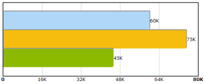
If you show values on the graph the Auto Scale option will scale large numbers to improve the display. For example 10,500 will be shown as 10.5K and 50,000,000 will be shown as 50M
Axis Maximum & Number of Division Lines
Normally the maximum value on the axis and how many division lines are used is set automatically based on the data you’re charting. However with some settings – particularly small numbers it doesn’t always get it right. For example :-
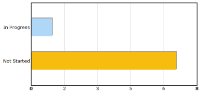
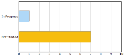
You can now manually specify these settings, in this example the axis is set from 0 to 10 with 10 division lines giving divisions at every exactly 1 intervals for a much better looking chart.
More details are in the online manual.
You can download and upgrade to the latest version without losing any settings.
.
Tags: New Version, PivotPoint, SharePoint


