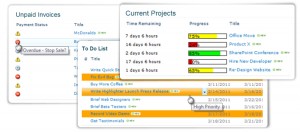
We are delighted to be able to let you know that we are about to add a new member to our family of SharePoint products.
Highlighter will let you bring your SharePoint lists to life with:
|
 |
Why did we feel the world needed SharePoint Highlighter you may ask? Well, SharePoint lists can be a little dull on the visual side. As people get more are more into dashboarding, finding ways of picking out different bits of information easily becomes ever more important.
When we looked at what’s on the market already we realised that though there are quite a few products that will give you one highlighting option – say progress bars, or KPI columns, or some kind of icon, there didn’t seem to be anything out there that would give users flexibility and choice in how they mark up their lists. So we thought we’d have a go.
After all how hard could it be?
“Looking back I think it would have been easier, and less painful, to eat my own eyes.”
I’m quoting Bjorn because he kind of became our hero during the product development process. The problems challenges fell into three main areas.
First there was the inevitable SharePoint issue. Everything looks simple on the surface. The examples given look straightforward, then you start digging into SharePoint’s dark and dusty undocumented corners and everything suddenly becomes a lot less clear. Once you get in to custom columns you are heavily into uncharted waters. Which basically means you don’t know what you don’t know – and neither does anyone else. There is very little reliable information around on this area, so we do owe a debt of gratitude to Bjorn Furuknap,his blog and his excellent book: “Building the SharePoint User Experience” (APRESS). Rare beacons of light in our darkest hours!
The second challenge was narrowing down our options. There were so many things we could have put into Highlighter – bells, whistles, flashing lights, Unicorns. The temptation to make it all singing, all dancing was almost overwhelming. But we had to resist. If we had put everything we wanted to in it a) it would have been totally unmanageable, and b) we wouldn’t have released in until 2099. So we narrowed it down to the features that we thought would be most useful. The rest remains on our private list of “Shiny Things” possibly for future releases, depending on how many customers say that really need to have unicorns prancing through their lists!
And finally there was the user interface challenge. Though we have been quite strict with ourselves in terms of the number of features we have put in, Highlighter still does some pretty fancy stuff. So keeping the user interface simple and intuitive was always going to be interesting. What we wanted to avoid was presenting users with so many options at the outset, that they just ran away screaming. What we have come up with is an interactive interface – almost a “wizard” (but definitely not a helpful paperclip!) We think it is pretty easy to use and we hope you will agree.
Highlighter is a bit of departure for us, it’s not a SharePoint web part, it’s a custom column. Every time I go to switch it on I have to remember not to “add a web part” to the page, but to add a column to the list instead. I am a mere marketer and my feeble brain struggles with such changes in routine!
And the other first for Highlighter is that it’s a first as project lead for our new developer Stuart Pegg – new job, new project, new area of SharePoint – we really believe in trial by fire for our people! But Stuart has come through with flying colors and a great product that we think you are going to love.
Highlighter is now in the final stages of testing and will be available in public beta in the next few weeks.
We are inviting you to pre-register for the free trial now – which will mean you will be one of the first to get the product and will qualify for our product launch discount.
Tags: SharePoint


