Tooltips – those little boxes that pop up when you hover over something – can be a blessing or a bit of a nightmare. It drives me nuts when people enable those snapshot tooltips on every hyperlink on a page. the resulting pop ups are huge, usually contain info I don’t want to see, and seem to hang around on the screen for ever.
But imagine a tooltip where you choose exactly what information is displayed? How cool would that be? Well that’s exactly what you get with tooltips in our PivotPoint web part for SharePoint – which is why I think they rock.
So PivotPoint: we take a SharePoint list – like this sales list, which has a record for each order Widget Wonderland have received over the past 4 years:
It’s a monster list, but hidden in the depths are some real gems of business information. So let’s apply Pivot Point to it to see which are our best selling products year on year:
Wow, hundreds of lines of data summarized in seconds – neat eh? We can see that in 2009 Agile App is a clear winner, but over the full 4 years Turbo Tool is our best performer.
But wait – see what happens when we hover:
Now I can not only see that we sold $125,365 worth of Turbo Tools in 2006, but also that we made 26 sales of that product, with an average sale value of $4,822, with Turbo Tool sales for 2006 accounting for 8% of our total sales to date. And I can see this data for any cell – just by hovering.
How long would I have had to spend shuffling through Excel spreadsheets to extract all that?
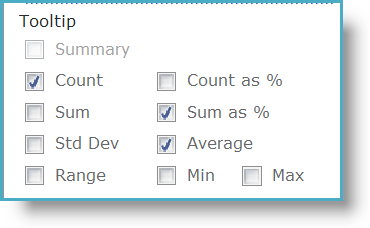
And the best thing about this feature is that you choose exactly what you display in the tooltip:
In the web part configuration panel you can choose exactly what value you want to display in you tooltip, giving you access to several layers of data, all in the one view.
Now how cool is that?
Not a PivotPoint user yet? Why not try it for free for 30 days?
Tags: PivotPoint, SharePoint, Tip, WebPart


