 So we all like to know how we are doing – hitting our targets, meeting our KPI’s, staying within our budgets, running out of vacation days.
If you record things like this in SharePoint lists you would hope it would be easy enough to see how your actual performance compares to your targets, budgets or KPI’s.
Well for those of you who have Enterprise and PerformancePoint it is possible – if not exactly a walk in the park – but for the rest of us this can be a tricky task. You need to find a way of bringing together 2 different sets of data:
- a Target or KPI – which is one item of data, which stays constant – no one likes a moving target do they?
- and an “Actual” figure which is the sum of a number of list items – sales, purchases, leave bookings, whatever, and which will clearly change as list items are added and changed.
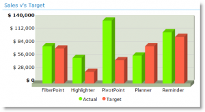
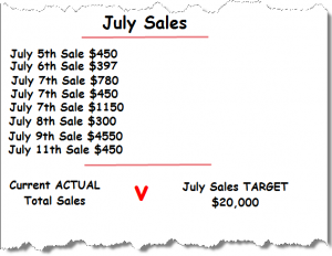
So if we were looking to compare Target and Actual sales for July, as in the chart above, the date would loook like this. A list of sales items, which will grow as the month progresses, producing a changing Actual total, and one Target item, which will stay the same throughout the month.
These two data sets would generally live in separate lists. The way many KPI columns work is by getting you to manually enter – and manually update – your changing Actual total into your Target list. Not great, as you never get to see how the situation is changing until you have done your manual update.
In a workaround for one of our PivotPoint customers we have turned this on method on its head – entering the static “Target” into the ~Actuals list (in this example the sales list) to allow you to produce a chart or table with our PivotPoint web part, which will show actuals vs targets and is updated as your actual data changes, without the need for manual intervention.
So here’s how.
Add a new column to your list. Make it a choice column with the choices as “Actual” and “Target”. Have it default to actual, as this is what the vast majority of items are going to be.
Then we simply enter a “Target” item for each category we want to compare. So in this example I want to see actual vs target sales for each of my products. So I have entered a Target Sales item for each of my products for July.
As the month goes on my team will enter actual sales for July, which will (hopefully) start to stack up nicely against my target.
So to see how things are shaping up set up a PivotPoint, get it to watch the sales list, and in this case a “This Month” view of the sales list. Display a Pivot Chart, in this case a column chart.
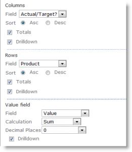
To see the actual sales vs target sales set it up like this:
- Get your column data from the Actual/Target field.
- Your Row data from the product field.
- And your values from the Value field.
And you should end up with a nice column chart like the one above.
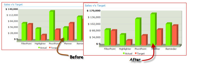
The best bit about this is that your chart will update as your list data changes. So let’s say I get a really huge Planner order:
Woohoo – you can take that to the bank!
So, it’s not perfect, it’s a workaround, but some of you might find it useful.
Places you could use this would include:
- Sales vs Target
- Budget vs actual expenditure
- Annual Vacation Allocation vs Vacation taken to date.
If you have any other ideas on where this might be useful we would love to hear them.
Tags: PivotPoint, SharePoint, Web Part


